Branding Aug 2024
Sanctuary Stays
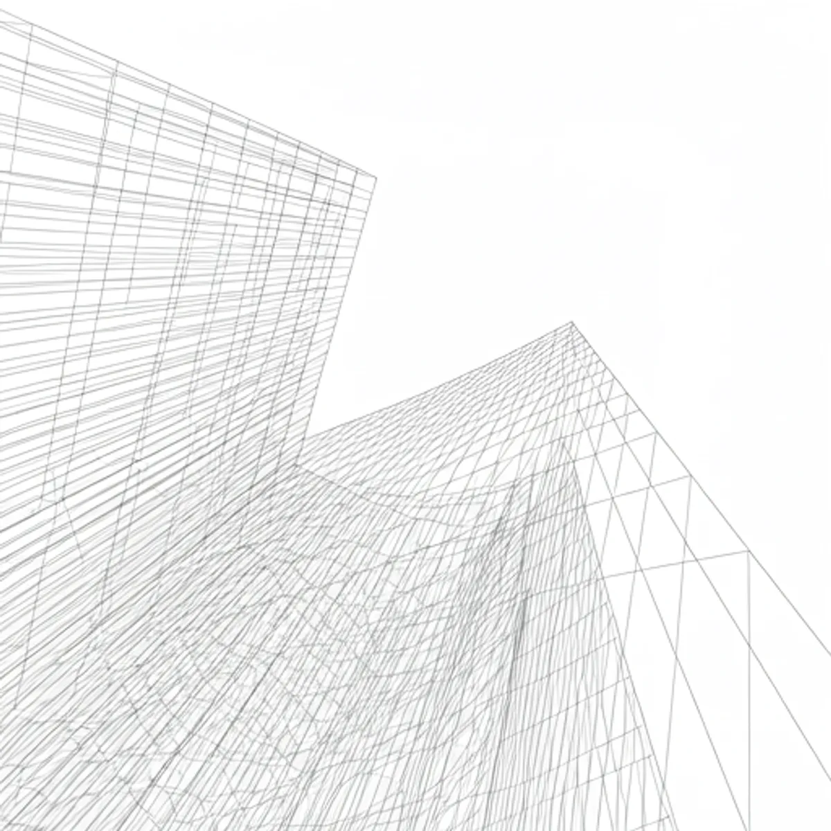
The branding for Sanctuary Stays reflects its core philosophy: providing spaces for quiet retreat and rejuvenation. The visual identity uses soft, architectural curves, a muted palette inspired by natural light, and typography that breathes.
Sanctuary Stays isn’t just a travel platform; it’s a curated collection of experiences designed for mental wellness. Our branding needed to communicate this sense of peace from the very first interaction.
Visual Language
- Muted Earth Tones: A palette that invokes a sense of grounding and stability.
- Generous White Space: Allowing the content to breathe and reducing visual noise.
- Architectural Typography: Clean lines and classic proportions that suggest timelessness.
Every element of the identity was chosen to lower the heart rate and invite the viewer to take a deep breath.